
Much more colours replace the old red, white and blue
For its 20th anniversary, Mall of America was in search of a new identity. Design agency Duffy & Partners took care of it. Check out the new designs and the thinking behind them.

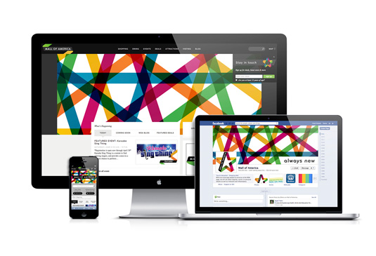
The world’s largest retail complex, Mall of America recently celebrated its 20th anniversary. In order to celebrate with something special, it went in search of a new logo design – something that would better reflect its position as a curator of popular culture.
The new logo (above) is a big departure from the previous identity (below), based on dynamic-looking star design with bright colours that are designed to be interchangeable.

The new branding for the Minneapolis complex – with elements including brand language, logo, promotional merchandise, website, social media pages and interior branding – was created by local design agency Duffy & Partners.

« We knew we had to harness the dynamism of their unique experience, the equity found in their American ingenuity and embrace all the ‘new’ that is their DNA, » says the agency’s founder Joe Duffy. « The result is a robust brand language that is fresh and full of energy and optimism, accompanied by a tagline crafted by Duffy – ‘Always New’. »
The new logo will appear on everything from billboards to business cards, gift cards to garbage cans. Mall employees will get new uniforms, and gift shops will be stocked with updated apparel, accessories and merchandise, all featuring the new logo.

